Bric-A-Brac Brand Identity Concept
Bric-A-Brac is a record and collectibles store that has been serving the Chicago area for many years now. The shop deliever a fun, vintage and retro pop style that you can see all over the store inside and out. This project was about giving Bric-A-Brac a modern and professional look to their brand identify.
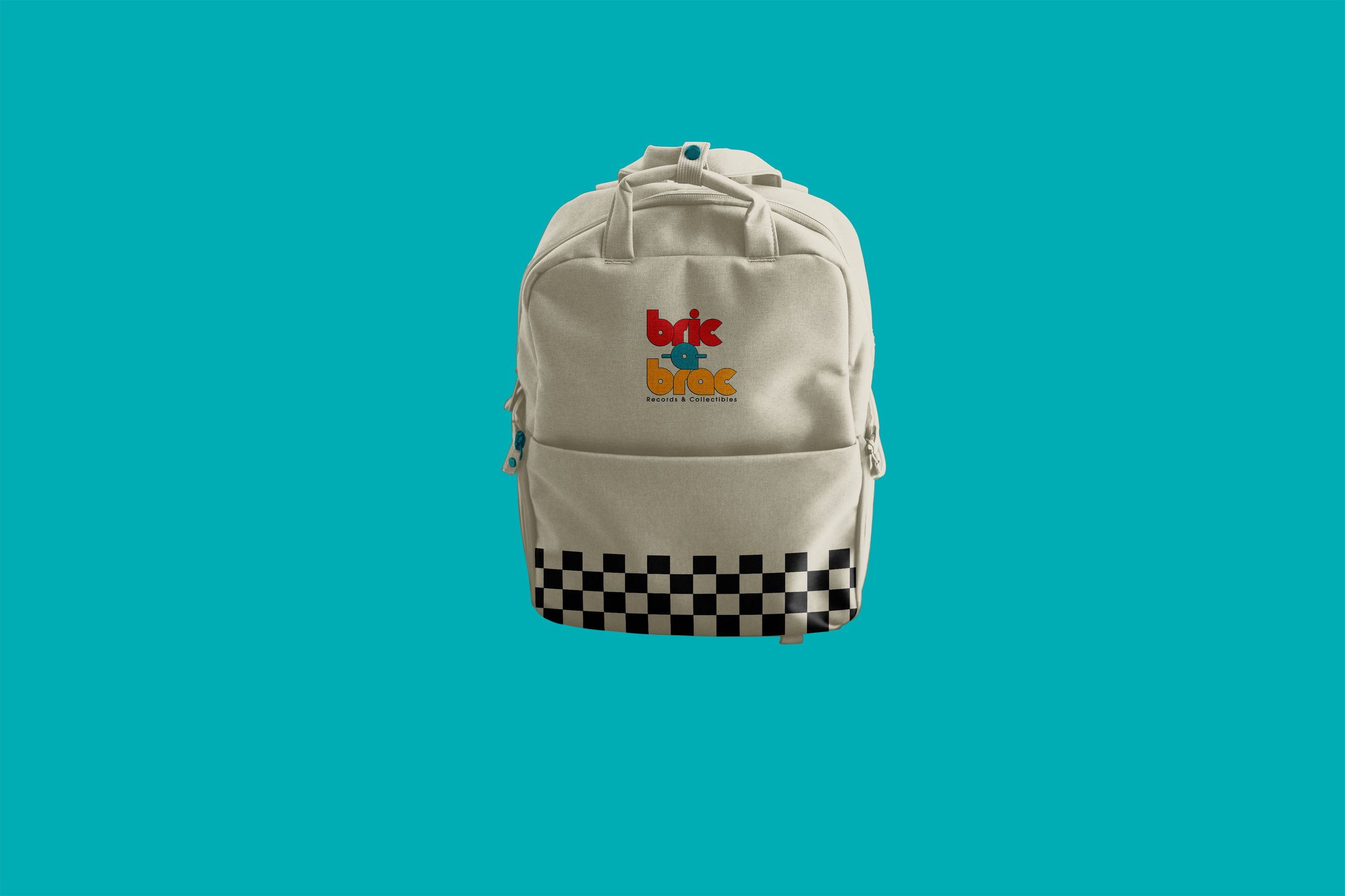
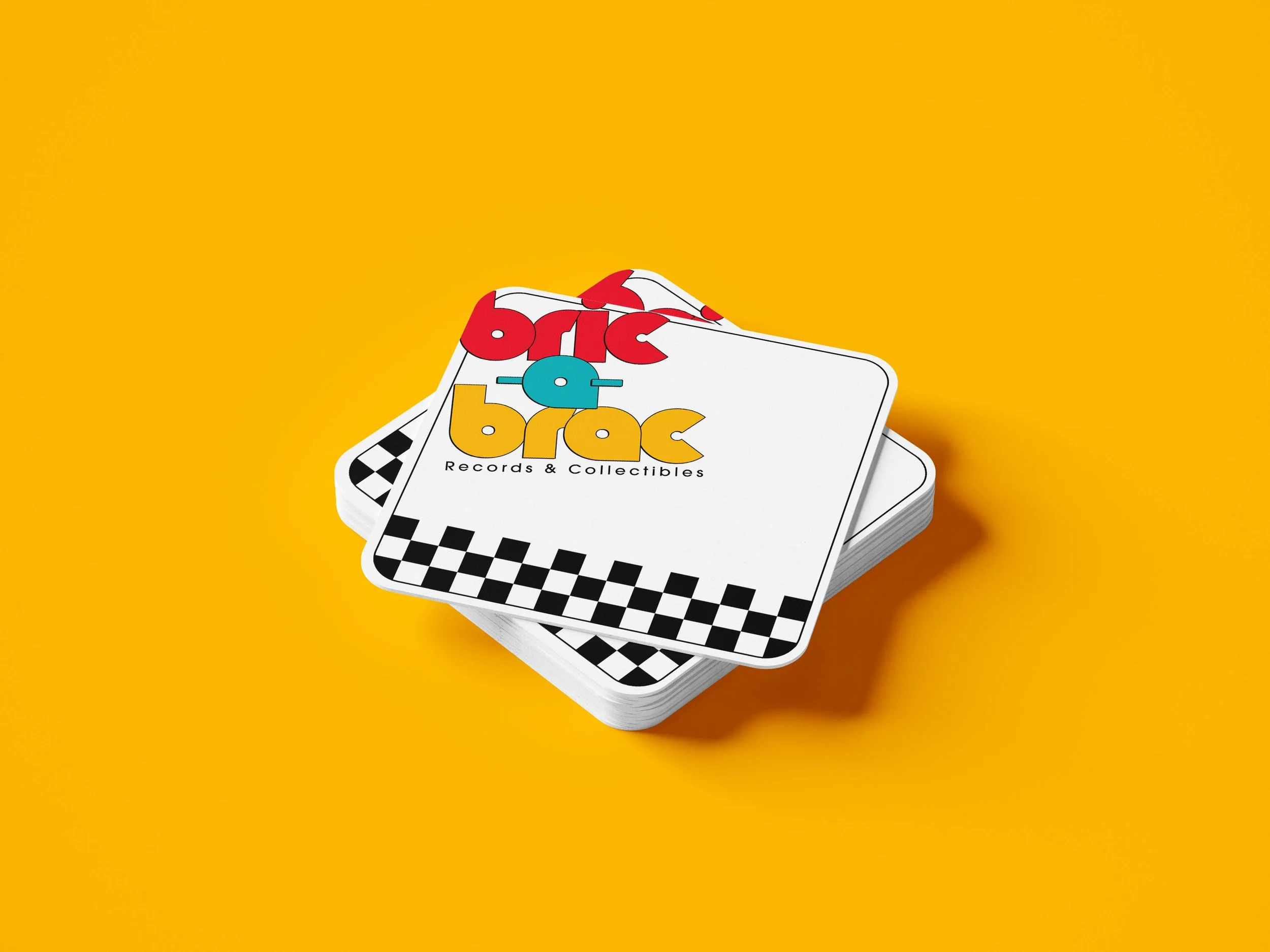
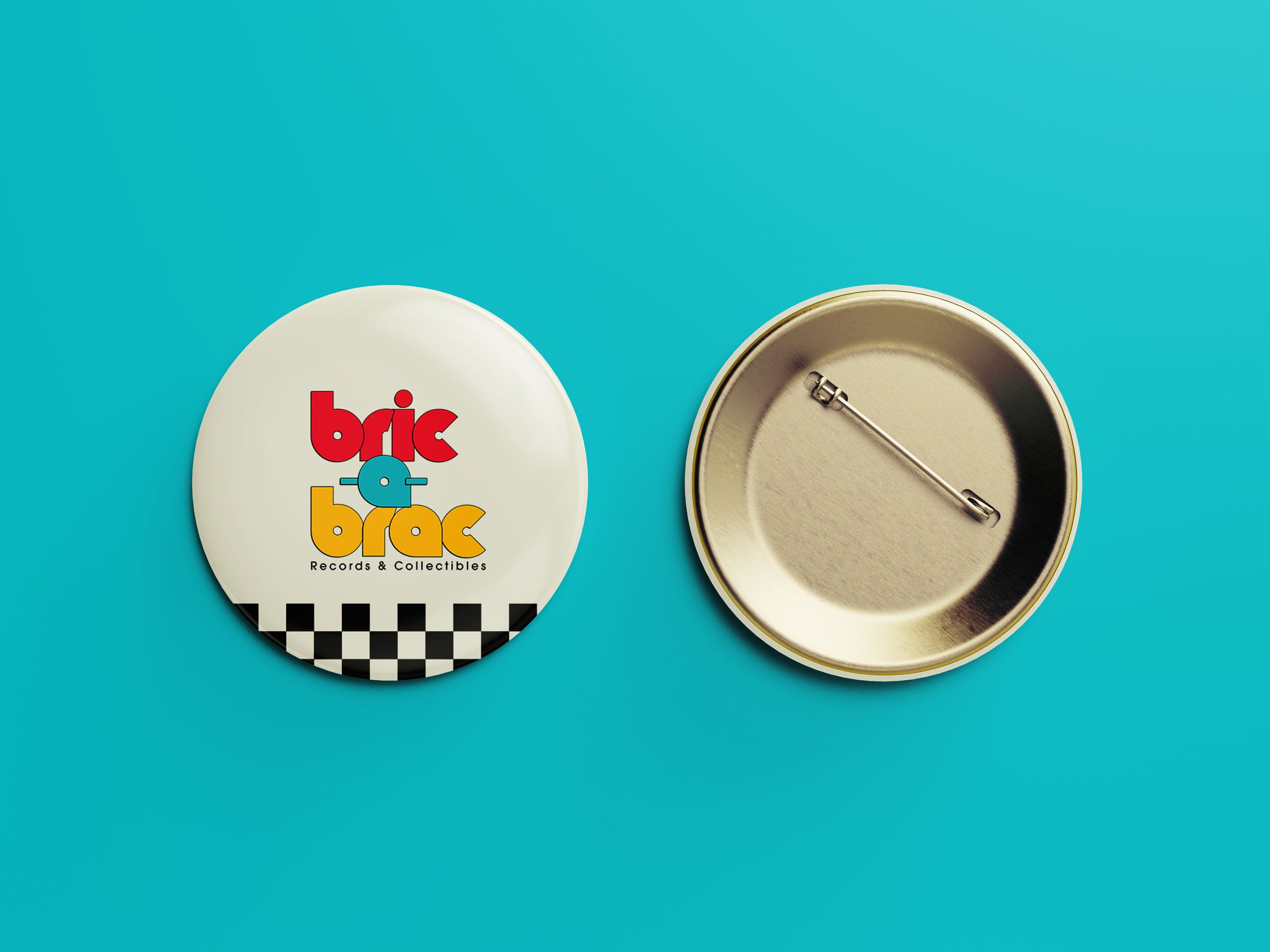
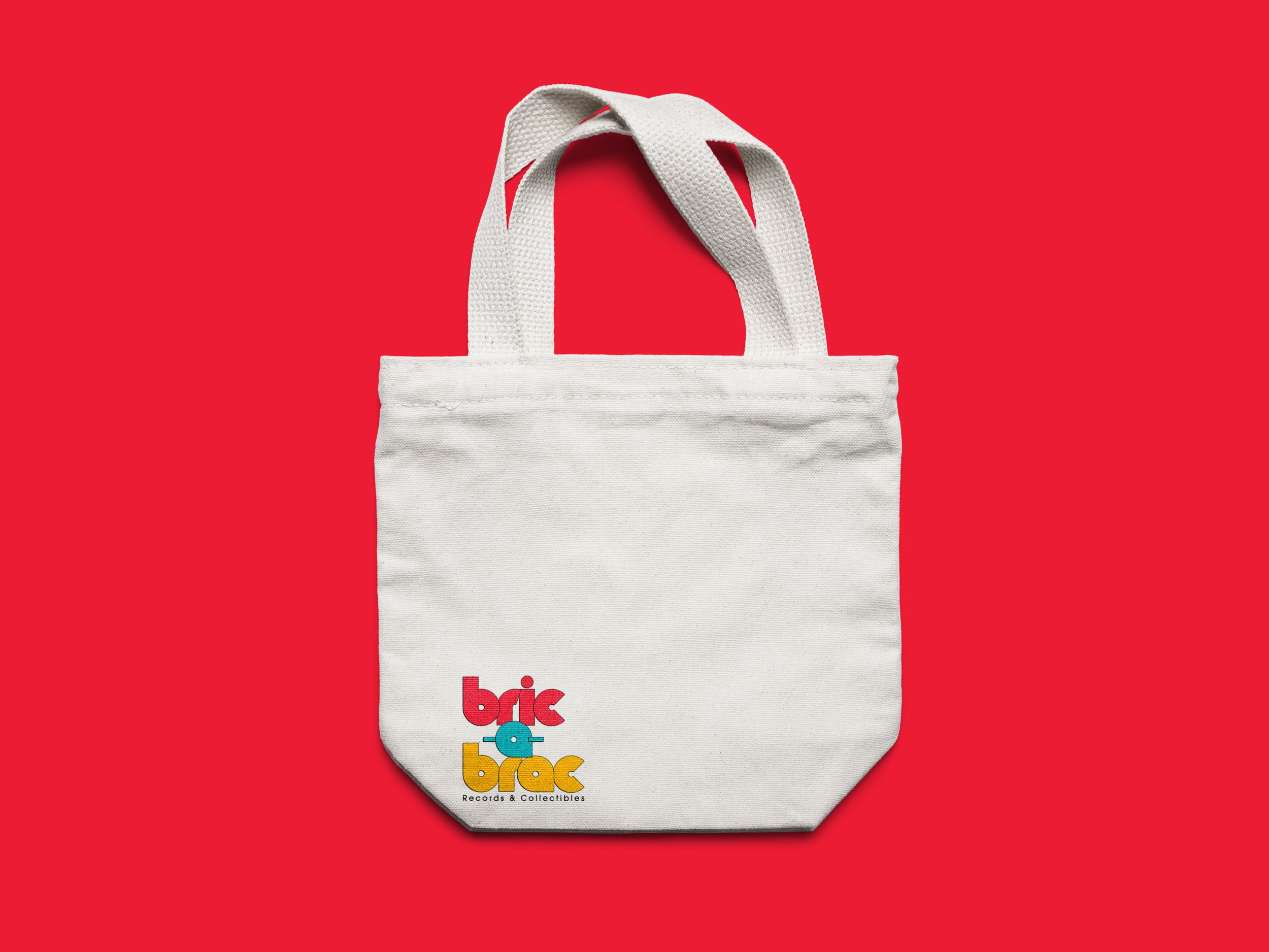
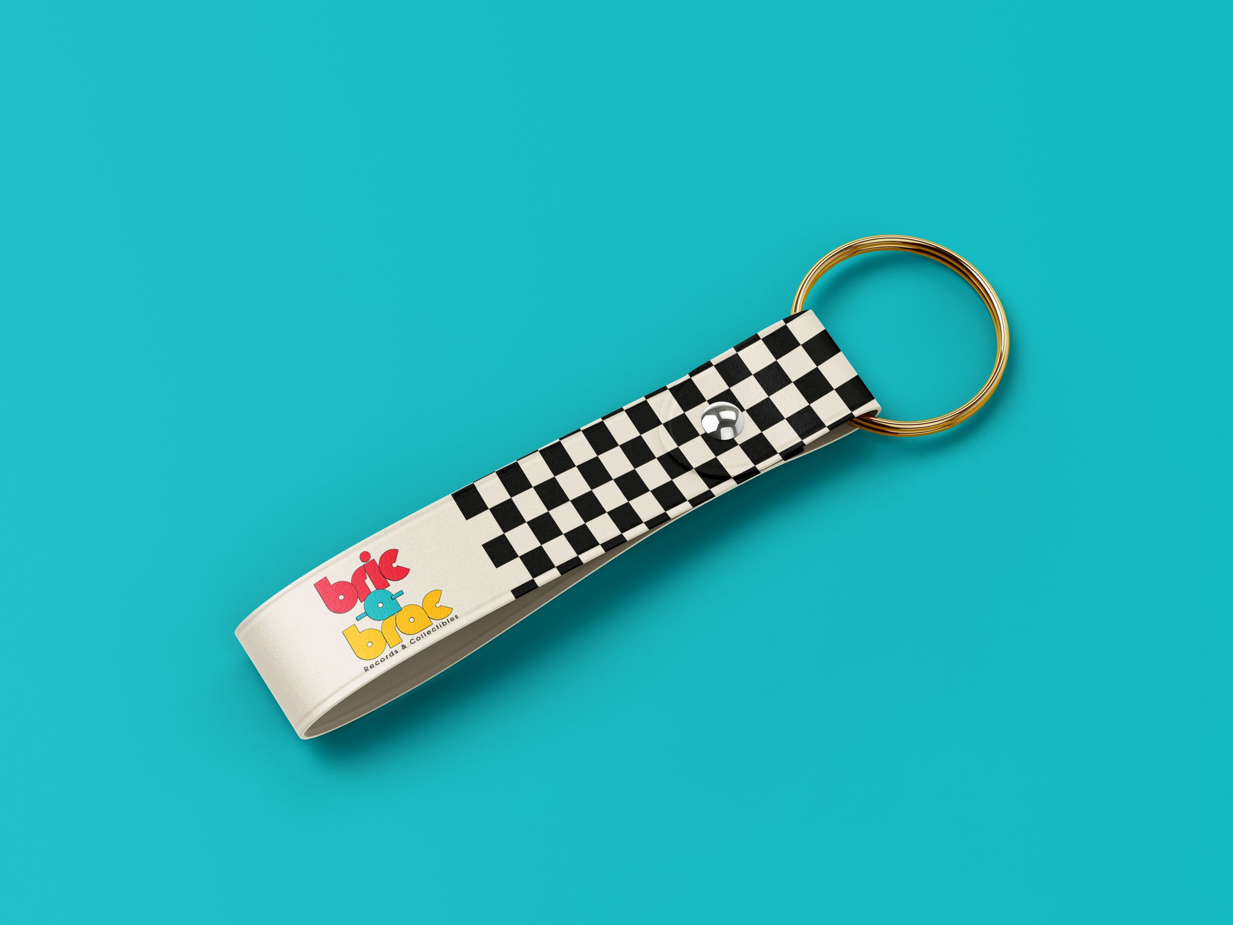
B-A-B Merchandise



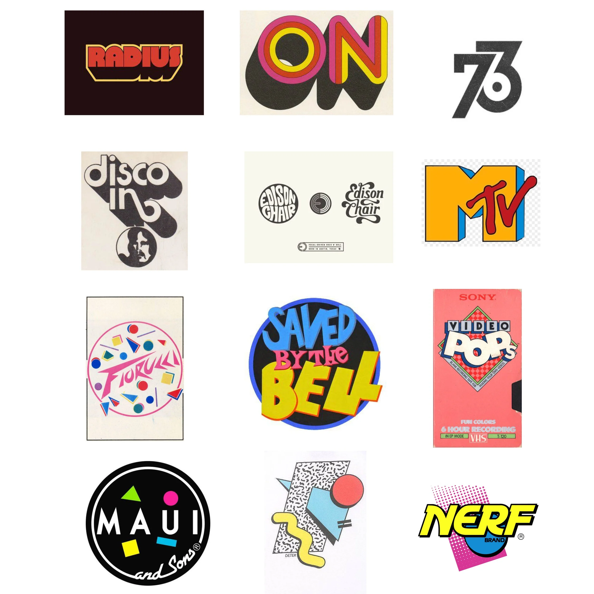
B-A-B Logo Research
The logo research for Bric-A-Brac was heavily focused on logo styles from the 80s and 90s. The use of deep shadows, unique color combos, and the overall fun these logos have was eye-catching for the research. Incorporating these elements into the Bric-A-Brac logo was essential.
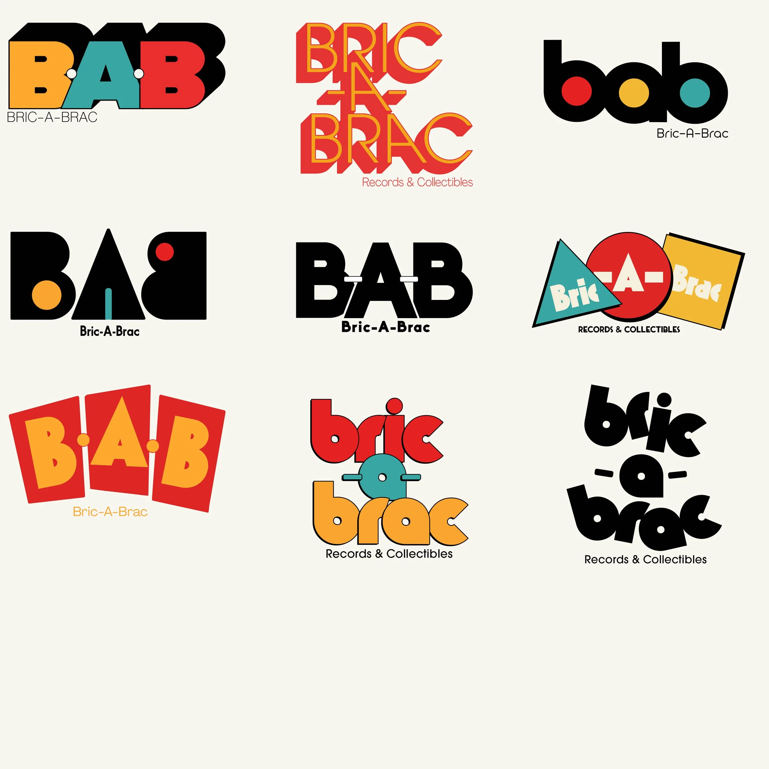
Digital Sketches
From what I gathered reference wise, we took all of that and turned it into logos that fit the Bric-A-Brac identity.
Typography and Color Palette
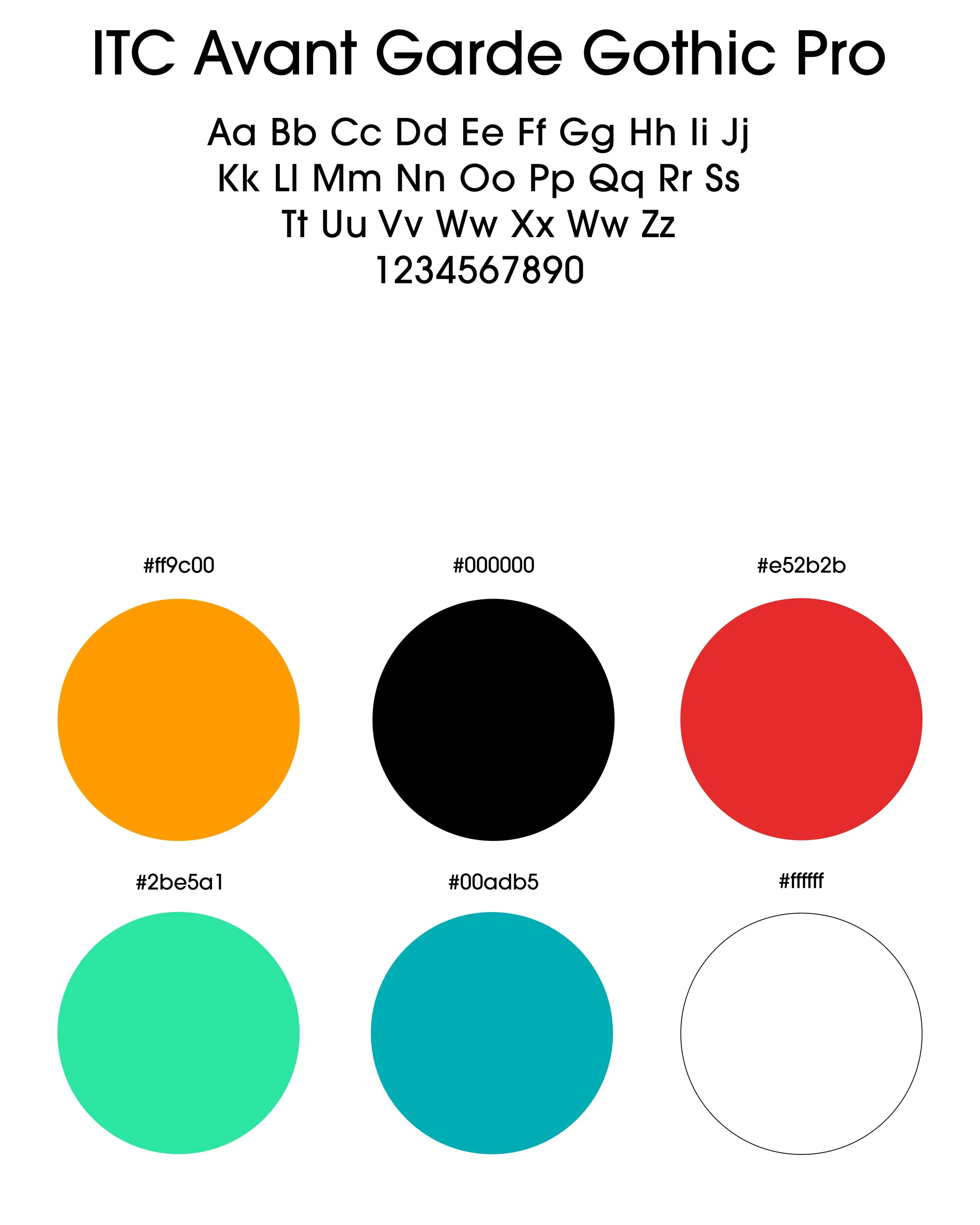
Both these two typefaces bring a super fun and vintage vibe to the logo itself. Knuckle Down has a rounded shape to it along with a san serif look that brings a very fun appearance. ITC Avant Garde Gothic Pro gives off a professional feel to it that compliments Knuckle Down.
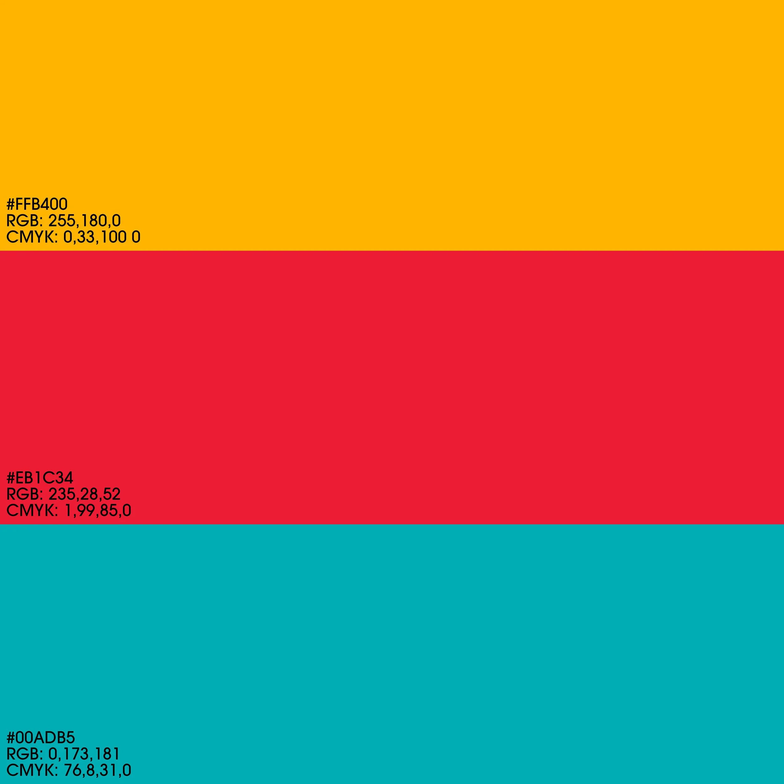
For the brand colors, I picked these three that fit very well together and with Bric-A-Brac as a company. Bric-A-Brac is a very colorful company that defiantly showcases that right when you walk into the store. Picking colors that demonstrate the time era but also connect to the theme of the brand was super important. These colors will stick for years to come.
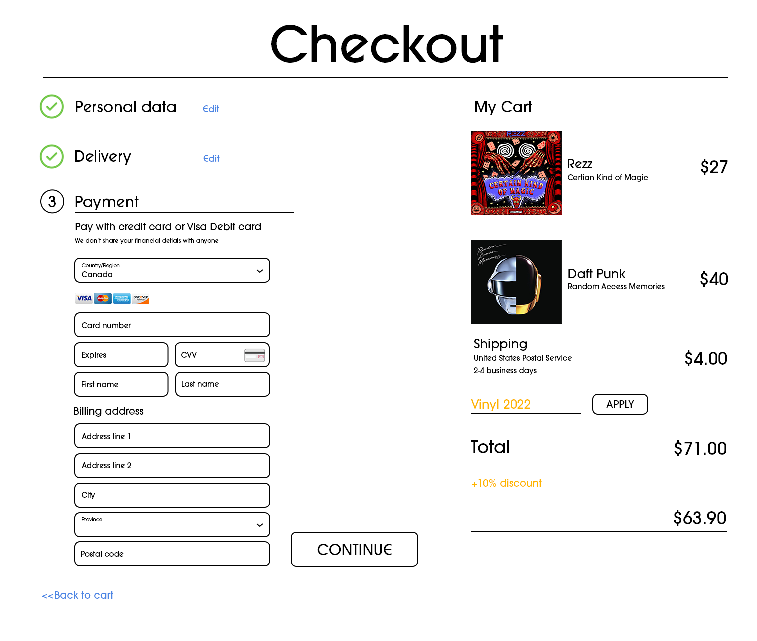
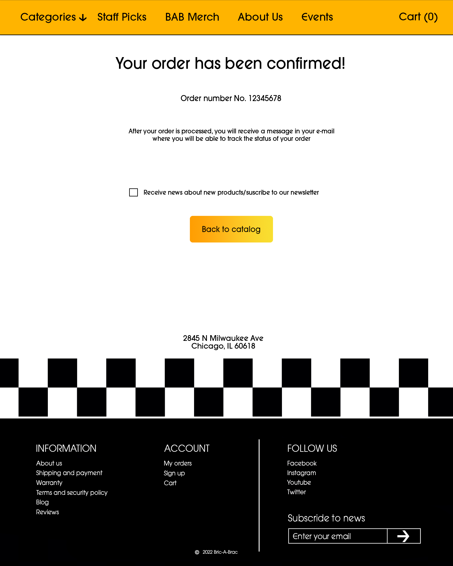
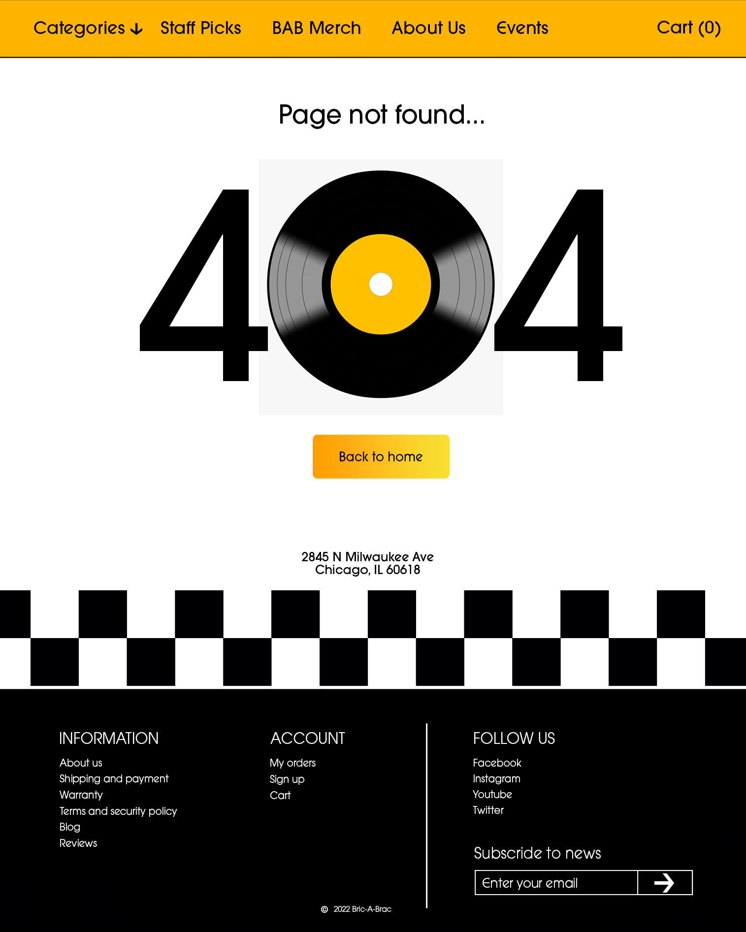
UX/UI Website Design Concept: Bric-A-Brac
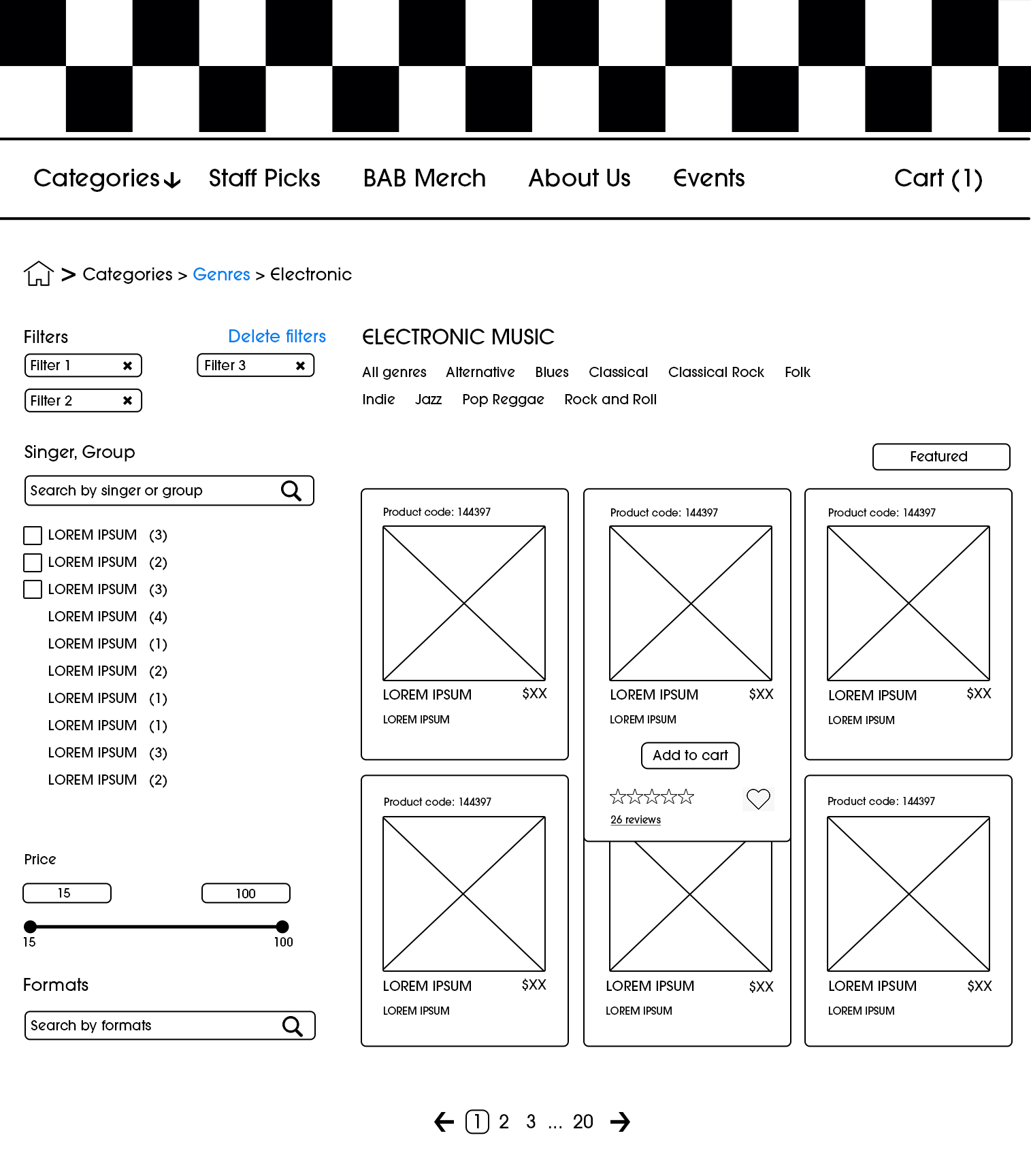
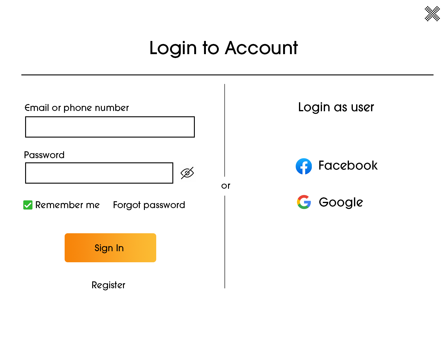
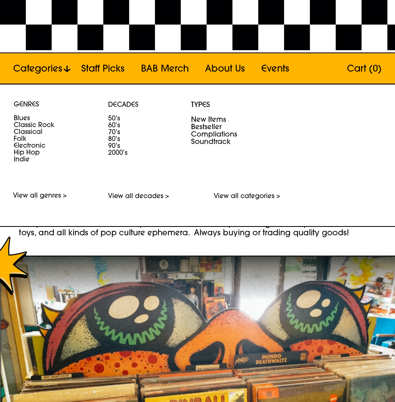
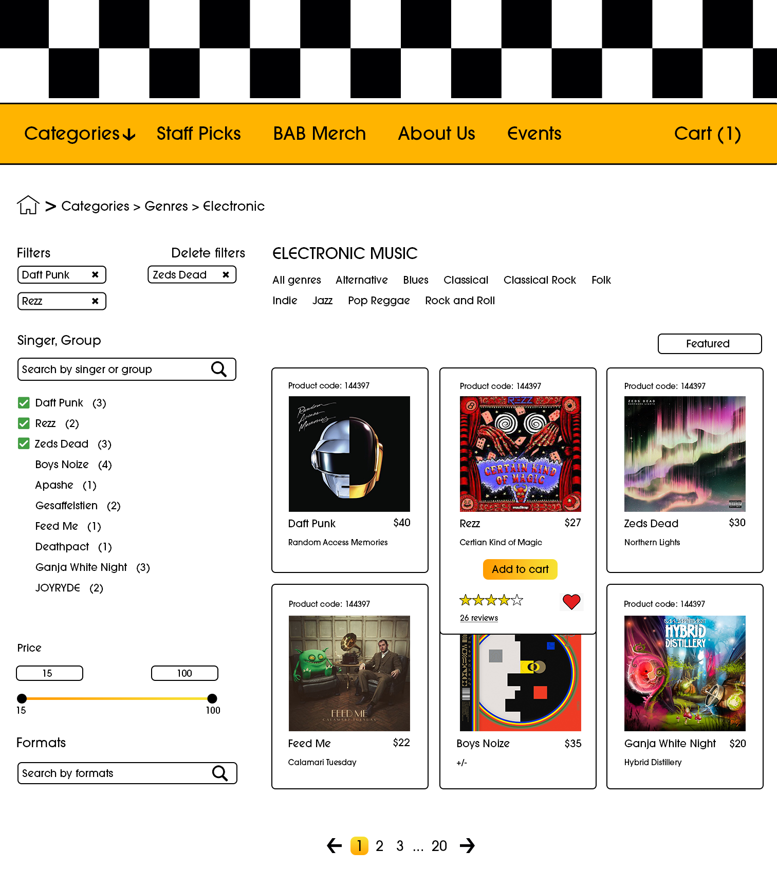
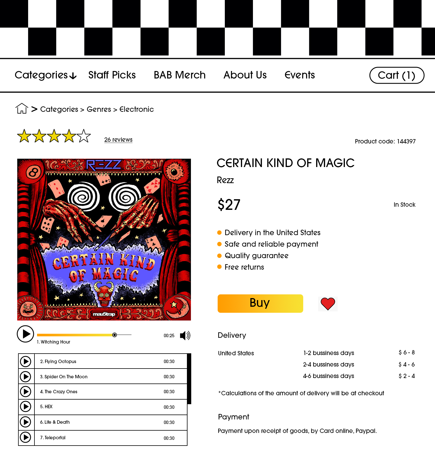
The main goal of this project is to create a cool and fun user-friendly website. This is a platform for those who love to find new music, read about news/events in their local area and have an enjoyable experience using the website.
Typography/Color Palette
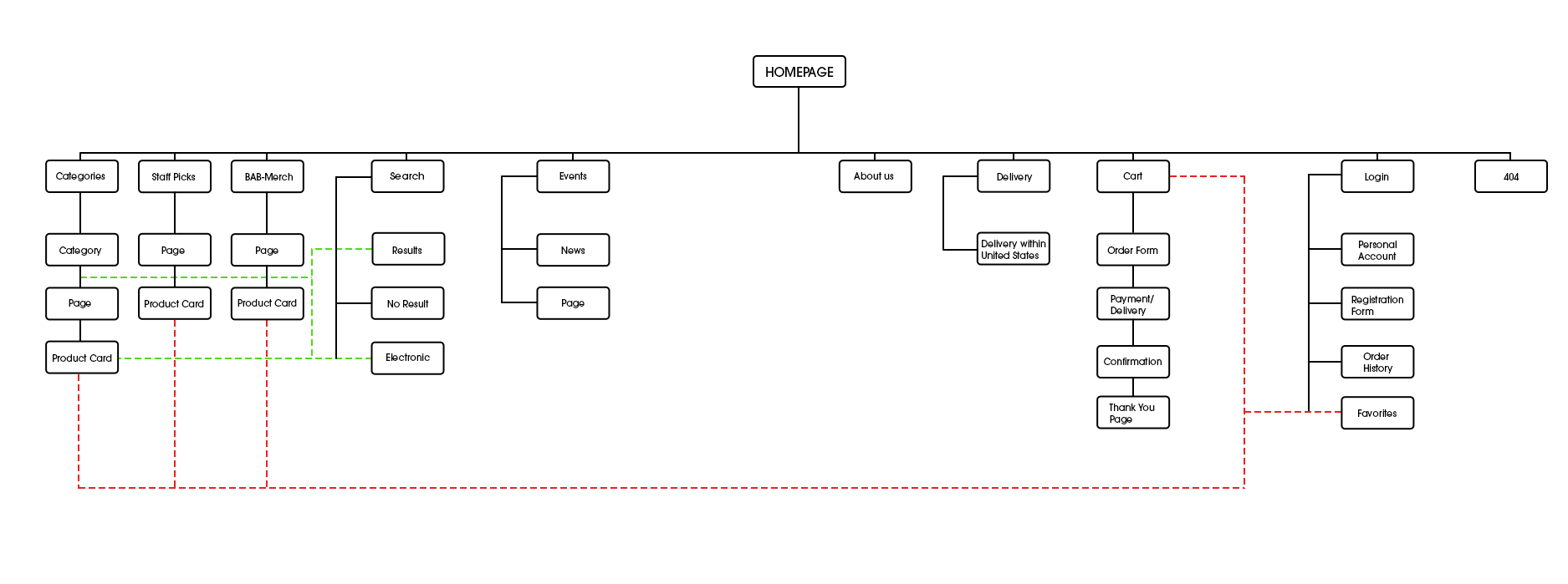
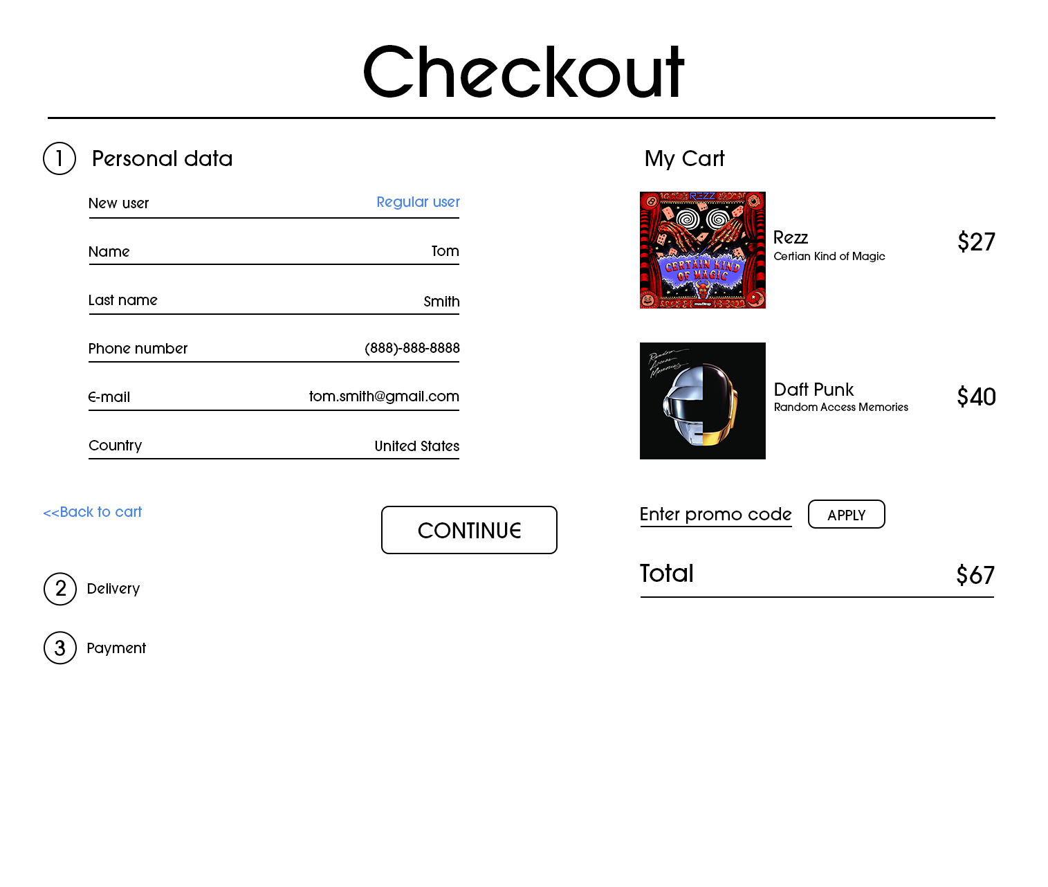
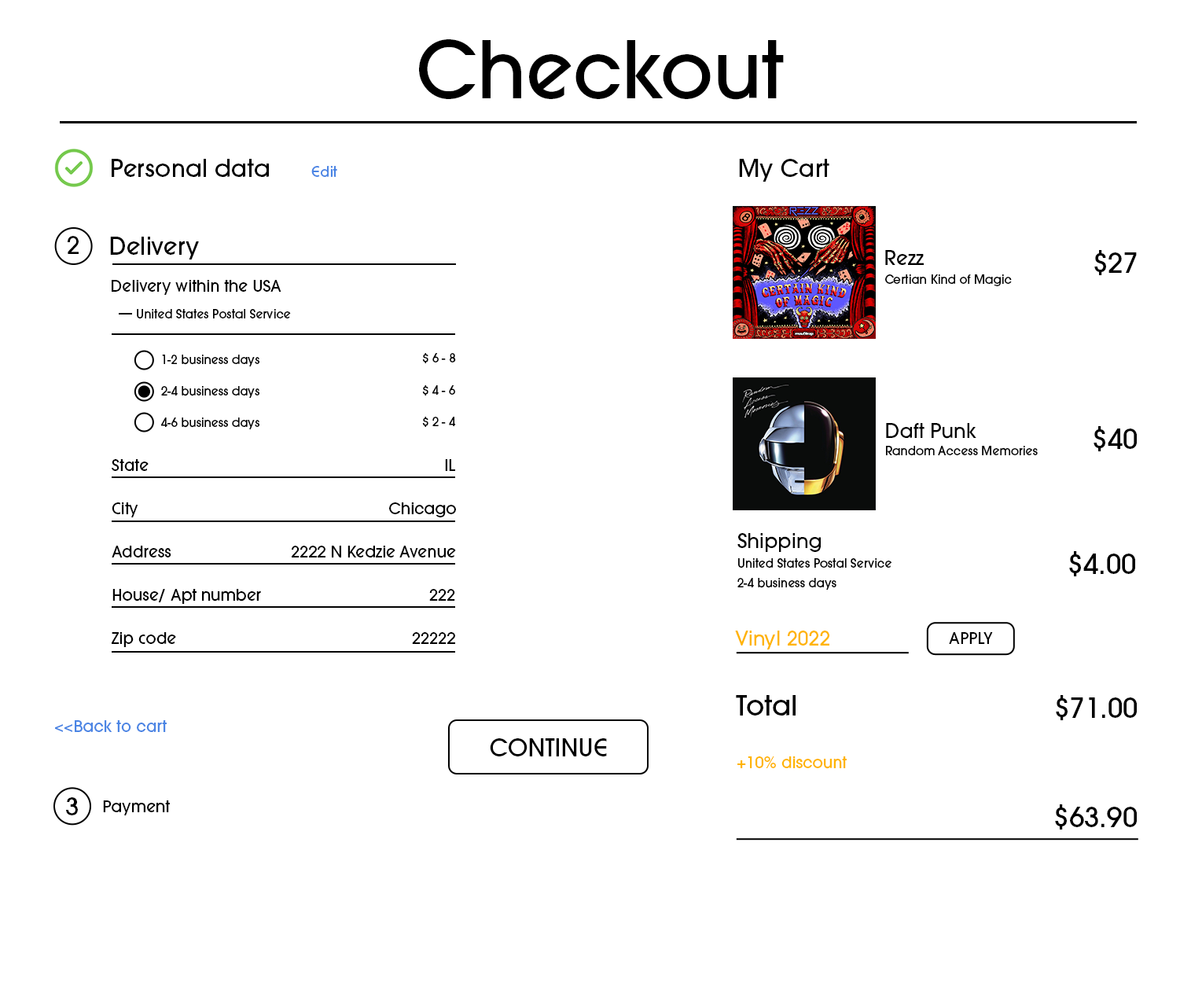
User Flow
